Minor cross-cultural data visualization
For the Minor Cross-cultural data visualization, the assignment was to collect my own data while walking from one place to the other and to create three different data visualizations from the collected data. The key was to visualize an insight you can’t immediately see when looking at the datasheet.
I have been collecting a lot of data during my study (Communication and multimedia design) and sometimes the variables can get a little boring and are often the same. So I tried to seek a fun insight that has not been chosen very often and in my opinion it worked out really nice in the end.
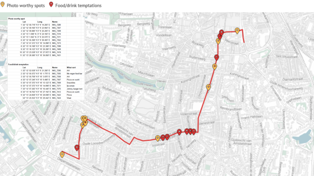
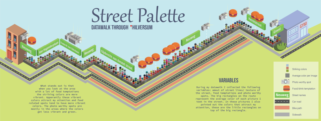
I took pictures every 20 meter during my walk. After my walk I was able to color pick all the outstanding colors from these pictures and calculate all the average colors of every picture. I also plotted every food/drink temptation I came across, and pointed out every photo worthy spot on the map. After I collected all these variables I started to look for correlation in the data.
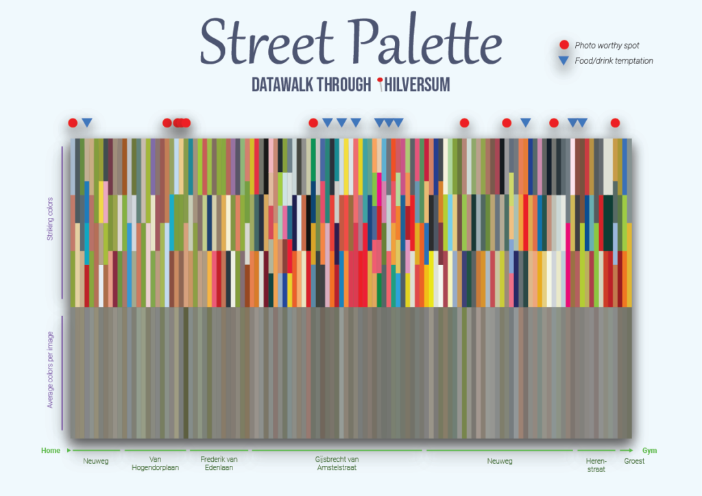
This is the end result:
(scroll down further to see the process)
Process
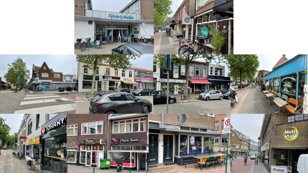
These are some of the pictures I took during my walk, I made sure I also had the location of every picture to process it in the data. I plotted all the photo worthy spots by giving the picture a heart in my photo gallery.
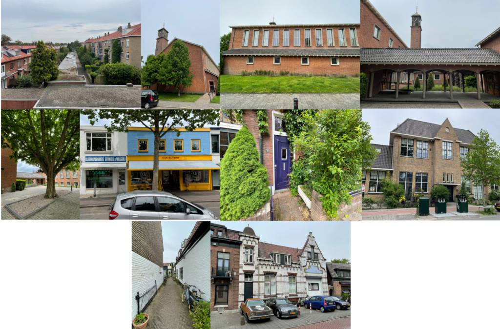
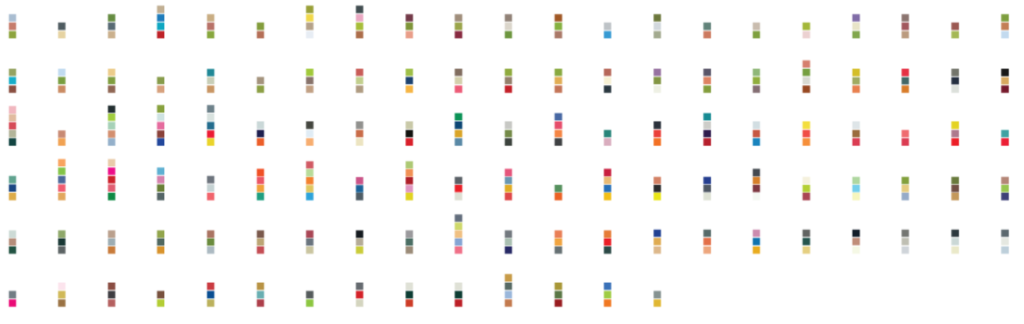
After my walk I could see exactly the route I took, because my I-phone plotted all of the locations of the pictures that were taken. With every picture I also calculated the average color per picture and color-picked all the colors that stood out to me.
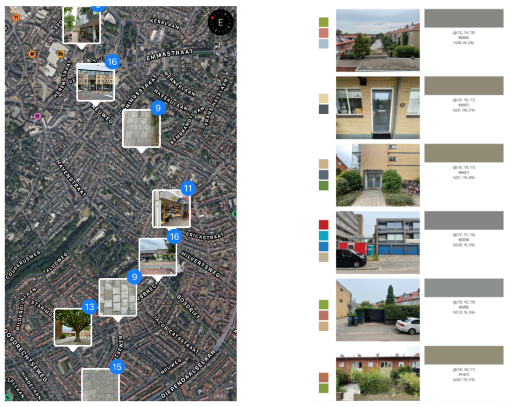
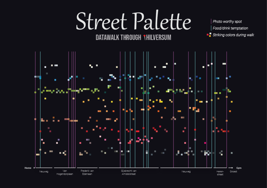
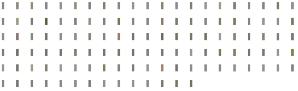
All the average colors per picture and the colors that stood out during my walk…
After that I plotted the exact route on a map and added all the locations of the 2 variables I kept track of.